The BEM Architecture
5 min read
One of the most difficult part about programming is naming variables. Programmers can build Advanced AIs that can talk to us like a human, generate the image of a black hole, but the one thing they get stuck on very often is naming variables. For front-end developers, its naming classes.
CSS is a language that is easy to learn but hard to maintain. As the project grows, it becomes difficult to maintain CSS without a proper structure. One class overrides the other and the CSS is all messed up. How do people overcome this? !important 🤐.

What is BEM?
There are various different methods and naming conventions like OOCSS and SMACSS along with BEM to write a structured CSS. Lets look at BEM as it is the most widely used method.
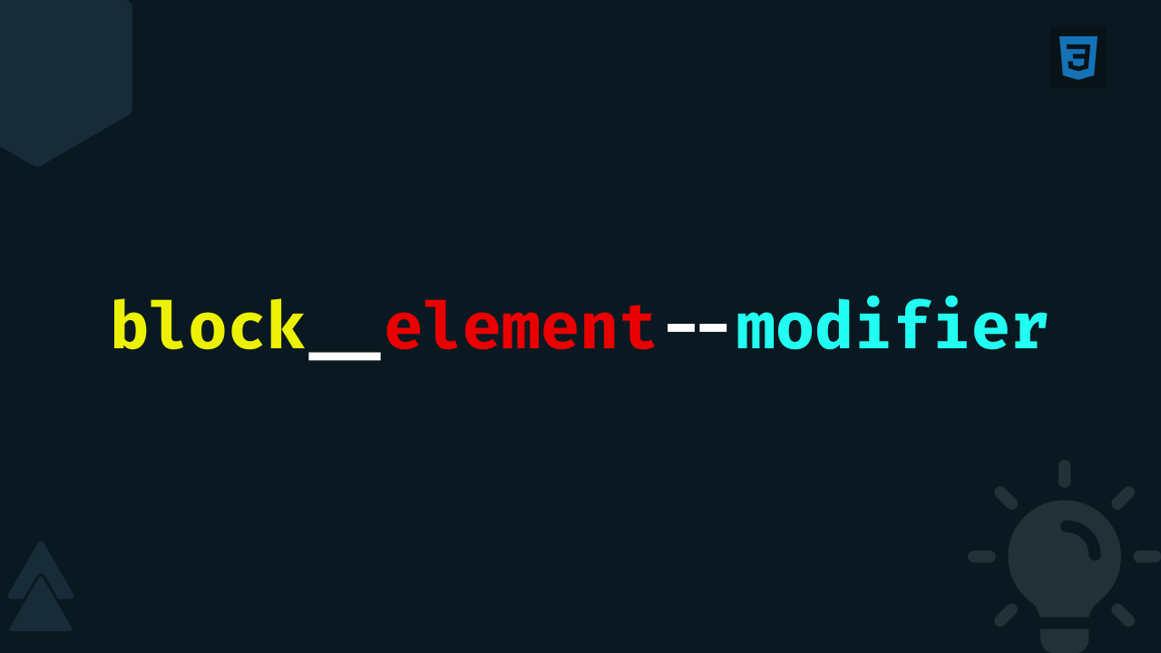
BEM stands for Block-Element-Modifier. The purpose of BEM is to encourage developers to write reusable CSS. We can think of a website a collection of reusable components.
What is a Block?
A Block is a independent, reusable component on the website. It does not depend on any other component for its styling. A block may contain other blocks. Think of block as a parent component which may contain some child components specifically related to it.
.card {
    /* Card styling */
}
Above are two examples of a block. The.card class can be re-used anywhere on the website.
Element - The child of the Block
An Element is a child of a Block. It can have only 1 parent block and are dependent on them. An Element have no standalone meaning and is semantically tied to its block. An Element is denoted by two underscores following the name of the block.
.card {
    /* Card styling */
}

.card__description {
    /* Card description styling */
}
The .card__description is the part of .card. This helps us visualize the relation between the components. The .card__description class clearly tells us that this is a description element present in the card block, where as if the class name was just .description we would have to search through CSS files to find out where it exactly belong.
The Modifier
Modifier, as the name says, modifies a block or an element in a particular way. Modifiers manipulate the block or the element to change their appearance, behaviour or state. A Modifier is denoted by two hyphens following the name of the block or an element.
.card {
    /*  Base Card styling */
}

.card--light {
    /* Card styling for light theme */
}

.card--dark {
    /* Card styling for dark theme */
}
Here, a website may have a light and a dark theme. The light and dark modifier can be used to change the appearance of the card according to the theme selected.
Too much writing 🥱
So, BEM clearly provides a structure to our CSS. Anyone working on the project can easily visualize the structure of CSS (even HTML) just by looking at the class names. It makes our CSS reusable, consistent and reduces the possibility of class name collisions and side effects.
The one thing you may have noticed is there's a lot writing. A block may contain lot of elements and there may be many modifiers associated with the blocks and the elements. Writing the block name (sometimes block name along with the element name) again and again could be frustrating.
.card {
}

.card__header {
}

.card__description {
}

.card__image {
}

.card__footer {
}

.card--light {
}

.card--dark {
}

.card__image--small {
}
This can just be a part of your whole CSS file. So, should be give up the BEM architecture? Is this the end of BEM?
Some of you may just write the whole CSS just because of the consistent structure. There's a great solution to this, SCSS (or Sass).
SCSS to the rescue 🦸
SCSS is a great way to overcome the problem of rewriting block names again and again. SCSS has a & (parent) selector, which will be very useful in writing BEM. Let's take the above CSS and convert it into SCSS.
.card {
    &__header {
    }

    &__description {
    }

    &__image {
        &--small {
        }
    }

    &__footer {
    }

    &--light {
    }

    &--dark {
    }
}
Here, the & refers to its parent. Inside the card block, every & would refer to .class and in the .card__image element, & would refer to .card__image. If we compile the above SCSS, the resulting CSS will the the one which we started with.
An Example
Lets take an example to conclude.
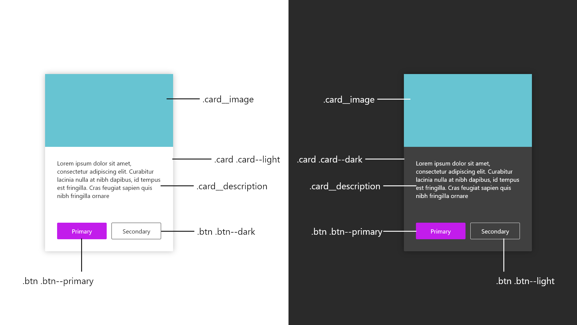
The Card can be either light or dark. The .card--light and .card--dark modifiers changes the appearance of the Card accordingly, while the .card class gives it the base styling like margin, display, padding, etc. The Card have two elements in it, the image and the description, represented by .card__image and .card__description. These elements have no meaning if they aren't associated with the Card block. Also, the Card block contain the Button block which is can be used independently.
The HTML for the cards can be written as follows:
<div class="card card--light">
    <img class="card__image" alt="Card Image" />
    <p class="card__description">
        Lorem ipsum dolor sit amet, consectetur adipiscing elit. Curabitur lacinia nulla at nibh dapibus, id tempus est
        fringilla. Cras feugiat sapien quis nibh fringilla ornare
    </p>
    <section>
        <button class="btn btn--primary">Primary</button>
        <button class="btn btn--dark">Secondary</button>
    </section>
</div>
BEM provides a modular structure to your CSS project. Because of its unique naming scheme, we won’t run into conflicts with other CSS names. BEM brings just another approach to writing cleaner and maintainable CSS. However, there are also some arguments against BEM that using it is not that useful.
I suggest giving it a try. If used properly, you can become a CSS Ninja 🐱👤.